Whilst designing and creating my indie/alternative music magazine, i opted to use a variety of features which are used on some of the UK's most popular music magazines within this specific genre. I decided to do this in order to make my magazine appear realistic and aesthetically pleasing. From personal knowledge and further research, i discovered that the magazines which suited my chosen genre (indie/alternative rock) were NME and Q magazine.
Whilst analysing existing indie/alternative music magazines i discovered that arguably, the most noticeable aspect of the page is the Masthead (title). Both NME and Q magazine use elements which highlight the masthead, portraying its importance. Whilst creating a title for my music magazine, i decided that i wanted to emulate the techniques used by NME and Q, and therefore opted to use a crisp, white font on a red background to highlight the importance of my masthead and make it the most noticeable aspect of the page.
 |
The front cover of my music magazine features a particular technique which is not commonly used by modern NME covers. Whilst designing my front cover i opted to use the 'Z' layout in order to challenge existing NME covers and add some originality to my front cover. Another reason why i opted to use the 'Z' layout was to create an effect which allowed me to fill specific parts of the page with information, yet keep the main image clear and text free as this aspect is arguably one of the most important on the page, as it shows the reader exactly which artist is featuring in the magazine.
Whilst styling my models i opted to use a variety of costumes to make the trio appear similar to current indie rock bands Kasabian and The Arctic Monkeys. To do this, i dressed the models in bomber jackets and a variety of t-shirts and shirts, as this is the type of clothing that the likes of the Arctic Monkeys and Kasabian wear. By using these costumes, i was able to create an authentic looking group who appeared as if they could in fact be in an indie/alternative rock band.
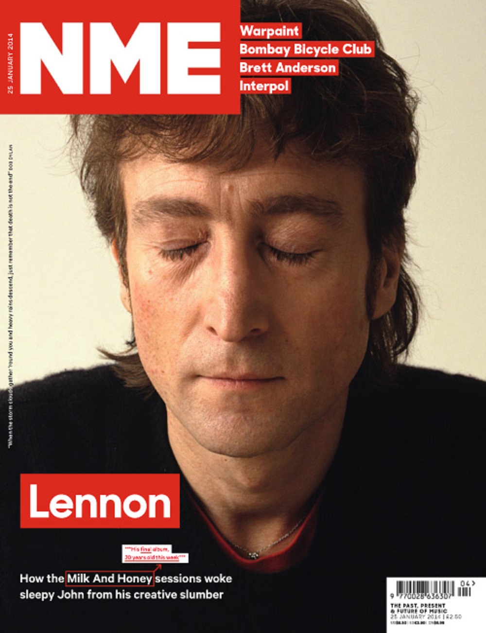
Whilst tanking my photos i opted to use a mixture of close-up shots and mid-shots. I decided to use these particular techniques to make the models extremely visible. To create these images i positioned the models in particular ways which could make this possible. For the mid-shots i positioned the models away from the camera so that the upper body of each model was visible. For the close up shot i moved the camera closer to the chosen model in order to focus specifically on the face. Whilst taking my photographs i decided that i wanted my models to look straight into the lens of the camera in order to target the audience and create a personal relationship. This technique also allows the models to appear arrogant and full of self confidence, something needed by members of indie/alternative rock bands. After analysing a variety of NME magazines i discovered a popular technique which i decided to emulate, this technique was the use of a close up on the front cover. I decided to emulate this technique so that the audience could focus on the most important artists in the magazine, the lead singer of the latest, extremely popular indie rock band.
 From researching and analysing existing magazines i discovered that the font used is a crucial aspect of each page. On the front cover and contents i have used a clear, bold font commonly known as 'HATTENSCHWEILER" This fonts crisp, bold appearance allows the magazine title to become easily noticeable and extremely recogniseable, something which is key when attempting to attract readers. I opted to use a second font on the contents page to add a noticeable difference from the front cover. The second font 'VERDANA' is extremely clear and simple to read and is ideal for a contents page, as a large amount of writing is used and therefore the text used needs to be clear and simple for the reader to see. On the double page spreads a third font has been used, this particular font is known as 'CRYSTAL LAKE' once again the font is clear and crisp, yet exciting and intriguing. I opted to use this font on the double page spread to reflect the bands style and personality and to once again keep each page different and unique. The font used for the main article is basic, simple yet extremely effective, this font is commonly known as 'Times New Roman.' This font has been tried and tested and has been proven to be the perfect font for an article as it is clear and extremely simple for the reader to see.
Whilst designing my music magazine i ensured that each page matched the specific genre by analysing existing indie/alternative music magazines such as NME and attempting to emulate a similar style. I also decided to use images of the featuring artists in order to form a connection between the artists and the audience. Whilst researching audience types, i quickly discovered that the audience best suited to my magazine were indie scenesters/hipsters. To ensure that my magazine was suitable for this particular target group i used a variety of images in order to portray to the audience what genre/style my magazine was. The images featured are of indie/alternative musicians who have similar fashion tastes to those of the indie scenesters, as the clothing the artists wear are unique and are extremely different to 'run of the mill' mainstream fashion.
The main artist which features in my magazine is an indie/alternative rock band commonly known as Marshall Stack. By using my previous experiences of artists from this particular genre, i wanted to make all three members appear arrogant and full of self confidence in order to emulate existing artists/band members e.g. the Arctic Monkeys and Oasis/Liam Gallagher. I decided to use this technique as it is a well known fact that artists with arrogance and self confidence are very popular with the target audience as they add a certain spark into the musical world.
Whilst designing my music magazine i precisely planned out each page and their specific colour schemes in order to make each page different and unique. The front cover uses a mixture of orange, yellow, red and white as each of these colours combined together allows the front cover to become a vivid, powerful statement and one which is unique from any other magazine in this specific genre. The colour scheme used on the contents page is that of the classic black, white and red. These tried and tested colours allows the contents page to appear completely different from the cover, and allows the audience to view crucial information in a simplistic way (as neutral colours do not draw the readers attention away from the text) The colours used on the two double page spreads are black, white, yellow and blue. Once again a different colour palette has been used to symbolise the ever changing world that is the music industry as well as the featuring bands uniqueness.
A good detailed answer - to make it better you need to make more specific references to real mags - you do this but not in every paragraph. Also you need to make sure that every point links to the question - does it apply conventions or challenge them? You need to constantly come back to this.
ReplyDelete