After completing my draft and receiving feedback I discovered that I had made a number of crucial errors whilst designing my music magazine. According to the feedback, although my front cover was extremely aesthetically pleasing, it was in fact the wrong genre, as it resembled that of a Kerrang (heavy metal/punk rock) front cover rather than my chosen style model/genre which is NME (indie/alternative music.) After taking these comments on board, I opted to search for examples of modern NME covers in hope that they would give me a sense of what techniques I would need to replicate in order to create a magazine cover which appeared realistic and one which is the correct genre.
Below are the top 3 examples I discovered whilst undergoing my research -

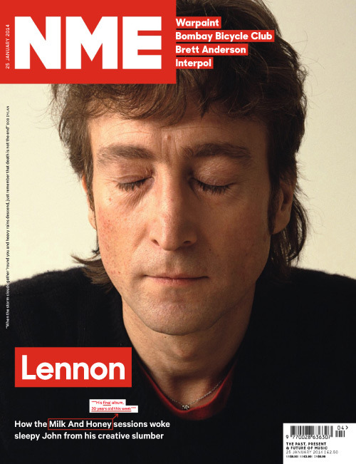

After analysing these modern NME front covers i have noticed a number of features which i will attempt to emulate whilst designing my final magazine cover. The most noticeable feature is the way in which each word is placed in a box. This allows each word to become and eye catching aspect of the page. The covers featured on this post also contain one main image, which allows the reader to see exactly who the featuring artist is. My own personal favourite from the following covers is the first example featuring The Smiths. Both the colours and layout of the page is extremely unique. This uniqueness is another aspect which i will attempt to emulate whilst designing my final music magazine cover.
No comments:
Post a Comment